Forms in React
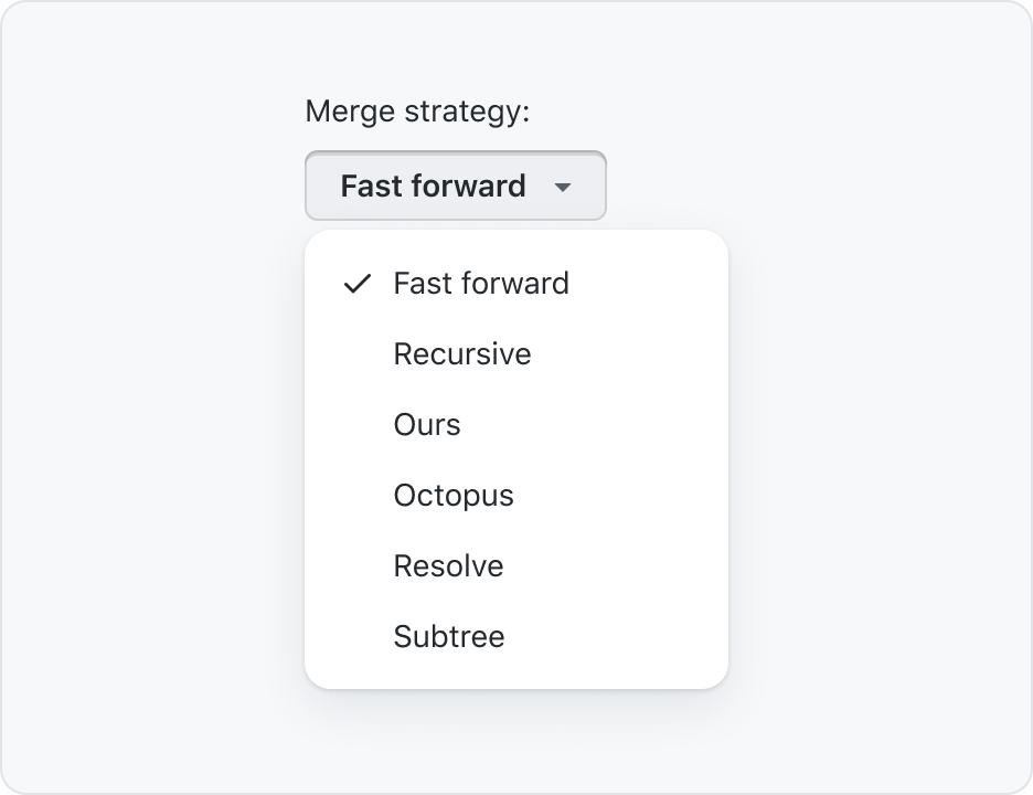
Action menu with selection
If the parent form control provides sufficient visual context, you may visually hide the label. However, you must specify text for a visually hidden label that is accessible to screen readers.
Primer React implementation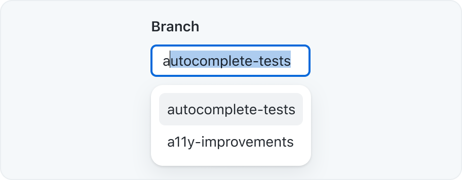
Autocomplete
An autocomplete input renders a text input that allows a user to quickly filter through a list of options to pick one or more values.

Checkbox group
A set of checkboxes to let users make one or more selections from a short list of options
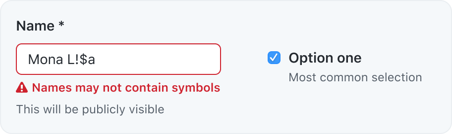
Form control
A form control renders a labelled input and, optionally, associated validation text and/or hint text.

Radio group
A set of radio inputs to let users make a single selection from a short list of options

Select dropdown
A select input may be used when a user needs to select one option from a long list
Primer React implementation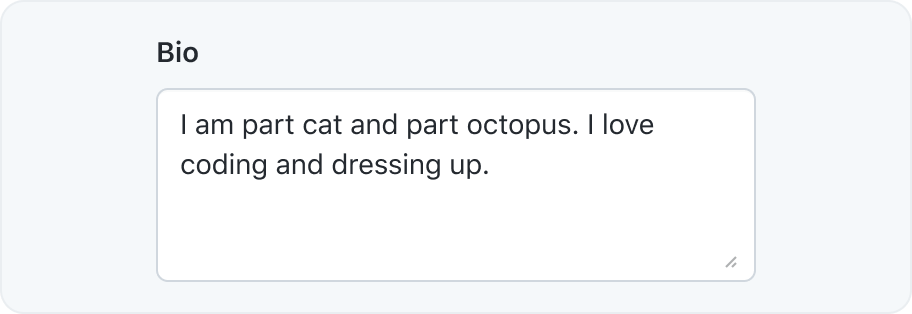

Text input
A text input is used to set a value that is a single line of text. See the list of types in the MDN docs.